
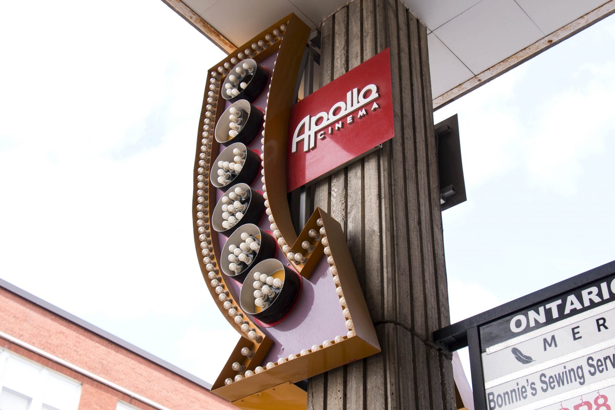

Imagine my surprise when among the new releases coming to the local Apollo Cinema they were advertising a screening of 2015’s film that redefined high octane, Mad Max: Fury Road. Now carrying the moniker of “Black and Chrome,” I was intrigued and read up on this rereleased version and was stunned to learn of its existence.
Here was an edition of 2015’s most visually striking film, an edition curated and conceived by director George Miller, no less, that robbed the original of all its gloriously dynamic colour palette.
I was certain this was a gimmick to get the film back into theatres and extort the baying public who have been starved for something similar to Fury Road after raising the bar of quality so unreachably high. It seems commonplace nowadays for films to be released in two tiers of shifting quality — one theatrical cut meant for the masses and approved by the studios and one supposed “director’s cut” that is to be taken as the real version.
I have often wondered why we are so accepting of this new form of cultural practice where art remains in this malleable state, ready to be remixed and experimented with for evaluation and commerce.
Can a film not stand on its own merits the first time around? And how strong was the original if it was necessary to “correct it” with a subsequent release? Shouldn’t art exist in the state it was presented in. The Star Wars special editions unfortunately come to mind.
Even with this in mind, I can certainly say that the black and white version of Fury Road was not a gimmick aimed purely at extra revenue. Outside of the colour, surprisingly nothing is changed and it remains the same exhilarating blitz into the hazardous waste you remember from two years ago.
This is still the Miller film I saw and loved, but with a new bold perspective that enhances the visuals on a visceral level.
While I adore the striking oranges and blues that popped off the screen in the original cut, rendering it all in vibrant grey gives it a texture and definition the original didn’t lack, but I never noticed. The minute details of dust and grime stand out on characters, the makeup on the War Boys is more conspicuous against the greys of the sandy flatlands and the lighting becomes more dynamic in the shocking contrast it creates.
And the Black and Chrome was the right title for this edition because what the monochrome does to the actual chrome frankly justifies the whole endeavor of this cut. The war rigs and elaborate vehicular death machines created for the film gleam much more than in the original cut. It was this detail that showed me what Miller was going for with his colourless experiment.
More than a stunt, Black and Chrome is an eye opening lesson in style that was only possible with this film. This is the perfect example of the potential that exists with colour correction, being able to transform the audacious Fury Road into something more captivating.
We are living in the era of cultural remix where nearly any artwork is subject to change, be it by the director themselves or by fans.
Black and Chrome is one of the first legitimate experiments in this vain to be from a position of mass appealing entertainment. The changes made to the original were done solely for the audience to see something we didn’t see in the first place, “witness it,” if you will.
On all fronts, this was a success.


Leave a Reply
You must be logged in to post a comment.