

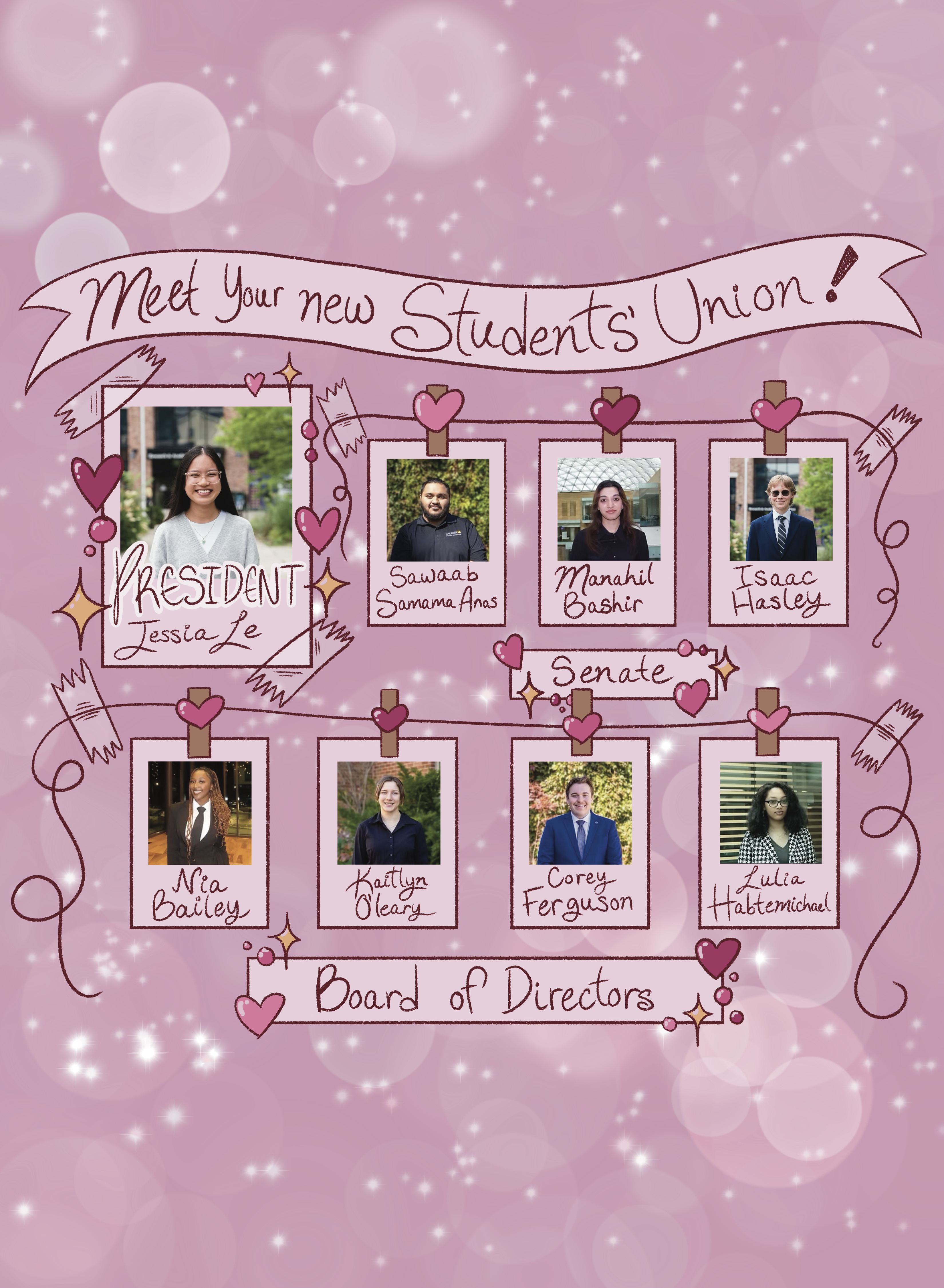
Friday afternoon, Wilfrid Laurier University unveiled its new logo and visual identity. The logo, designed by Scott Thornley and Company (STC) maintains the “Laurier” type face of the university’s current logo, however, the font has been changed to a sans serif, which the designers felt gave it a more modern look.
The new logo will also contain the tag line, “Inspiring lives”, a reference to the university’s mission statement, which is “Inspiring lives of leadership and purpose.” In addition, the new visual identity will feature slight tweaks to the font in Laurier’s official crest.
STC is the same design firm that designed the “Laurier100” logo, which has been on banners throughout campuses and the communities in both Kitchener-Waterloo and Brantford.
The event on Friday afternoon was entitled “Turning the Page” and was simulcast with the Laurier Brantford campus.
Friday’s event also had a revelation regarding WLU’s past. Andrew M. Thomson, a Laurier alumnus and former history professor at both the Waterloo and Brantford campuses, unveiled his book on the university’s history entitled, Leadership and Purpose: A History of Wilfrid Laurier University.
For more on both the visual identity announcement and Thomson’s book see Wednesday’s edition of The Cord.


Leave a Reply
You must be logged in to post a comment.